ServiceNow reporting made easy: A comprehensive guide to custom reports and dashboards
Reporting enables organizations to gain insights into their IT processes. It streamlines performance monitoring and helps make data-driven decisions. If you’re using the ServiceNow® platform, its built-in reporting capabilities will help you drill through data through real-time reports.
You’ll be able to track key performance indicators (KPIs) and measure the effectiveness of IT services. On top of this, the performance analytics of ServiceNow® will help you identify trends and find areas that need improvements.
In this article, we’ll take you through the process of creating tailored reports and dashboards that cater to the needs of each level of ServiceNow user. Plus, we’ll show how Virima’s Discovery and Dependency Mapping integration with ServiceNow® can increase the effectiveness of ServiceNow reporting capabilities.
Understanding ServiceNow® Reporting
Custom reports in ServiceNow provide a powerful way to analyze data from a variety of CMDB tables and data sources. These tables house valuable information about Configuration Items (CIs) and their intricate relationships.
Among the numerous report types, List Reports reign supreme, displaying records in a tabular format reminiscent of Google Spreadsheets. But it allows you to delve deeper into the world of data visualization with Bar and Column Charts, Pie Charts, Line Charts, and even enigmatic Bubble Charts. The possibilities are endless, and the insights, are valuable.
Why businesses need reporting and how ServiceNow® helps
Data-driven decision-making: Reports enable businesses to make informed decisions based on accurate and up-to-date data. ServiceNow’s real-time reporting capabilities provide organizations with the necessary insights to optimize their processes.
Performance monitoring and trend analysis: Reports help businesses track performance, identify trends, and monitor KPIs. ServiceNow’s customizable dashboards and reports allow users to focus on the most relevant metrics to them and ensure continuous improvement.
Collaboration and communication with stakeholders: Sharing reports with stakeholders ensures everyone is aligned on decided objectives. ServiceNow enables users to create, share, and schedule reports that promote effective communication and collaboration.
Getting the most relevant and useful information for decision-making: ServiceNow’s reporting features allow organizations to access the most relevant information tailored to their specific needs. Businesses can gain insights into various aspects of their IT environment, such as incident management, change management, and asset management.
Data sources to create reports in ServiceNow®
ServiceNow organizes data in a relational database structure, consisting of tables that store records. These tables serve as the primary data sources for creating reports. The platform also has numerous pre-built tables for different modules, such as
- Incident Management,
- Change Management,
- Problem Management,
- Service Catalog, among others.
Examples of a few tables are as follows:
- cmdb_ci_computer table to create reports about computer CIs, such as desktops, laptops, and servers within an organization.
- Incident Table to create a report on the number of open incidents by priority.
- Change Request Table to report on the average time taken to implement changes by category
- User Table to create a report on the number of active users by department
Creating reports with tables and reference fields
ServiceNow allows you to use reference fields while creating reports from a table. These fields are used to establish relationships between different tables. For example, if you want to create a report on the number of incidents linked to each problem, select the Problem table as the data source and pull data from the incident table using the reference field.
Read: How Virima’s ViVID™ Service Mapping Integration Helps in Reporting and Auditing
Creating Custom Reports in ServiceNow®
You can create reports in ServiceNow in two ways.
In the first way, you type “Reports” in the filter navigator search bar as a system administrator. From there you click on “Create New” under the “Reports” menu and open the ‘Create a report’ interface (Report Designer).
In the other way, you type the table type directly on the filter navigator (say, incident) and open the database. From there you right-click on any column and open the Report Designer to create a report.
In both the interfaces, you need to fill up several sections to create a report:
Data Source Section:
Here you specify the Report name, Source Type (either choose Data Source/Table), and Table (The CMDB table).
Tips for selecting the appropriate data source:
- Choose a table with relevant data for your report’s purpose
- Ensure that the table contains the necessary fields for the report’s filters and conditions
- Consider using a database view if you need to combine data from multiple tables
Type Section:
This section determines how the data is visualized in the report. You can use this option to select one visualization option from many such as a list, pie chart, bar chart, etc.
Configuration and Style:
This section offers options to set report filters and conditions. Filters allow you to include or exclude specific records based on field values, while conditions enable you to define criteria that records must meet to be included in the report.
Once you save the report. You can choose whether to make it visible to specific users or groups. For example, you can make a report related to incident assignment groups only visible to people with ITIL roles.
Creating Custom Dashboards in ServiceNow
The Dashboard Designer in ServiceNow allows you to create custom dashboards with widgets displaying reports, charts, performance analytics, and other data. These are crucial for consolidating visualizations and providing meaningful insights to users in a single location. And creating a custom dashboard is similar to creating reports.
To create a dashboard, you need to type “Dashboards” in the filter navigator search bar and click on “Create New” under the “Dashboards” menu that appears.
Next, you give it a name and specify the group it belongs to. You can name a dashboard an “Incident review dashboard” if it’ll be used to overview the incidents.
Understanding Dashboard Designer interface:
It consists of several sections such as
Widgets:
A selection of available widgets such as the report widget can be added to the dashboard. Once you select the reports widget, you can add reports to the canvas by searching the filter or from the drop-down of created reports.
Canvas: It displays the current layout of the dashboard, where you can add, arrange, and configure widgets. You can customize their size (dimension) to fit the screen.
Settings: Offers options to customize the dashboard appearance, such as themes and background color or image.
Once you create a customized dashboard, you can share it with specific users, groups, or roles.
Best Practices for ServiceNow Reporting and Dashboards
Ensuring data accuracy and relevance
Having accurate and relevant data is crucial for effective reports and dashboards. To achieve this, make sure your data sources are up-to-date and reliable. For that, the best option is to integrate a Discovery tool such as Virima Discovery. This tool ensures the data related to physical and virtual assets in your ServiceNow CMDB remains up-to-date and accurate.
In addition, refine the data displayed in your reports and dashboards using filters and conditions. This ensures only relevant information is presented. Don’t forget to double-check the calculations or aggregations used in your reports. Also, invite feedback from your team members to improve the accuracy and effectiveness of the reports, making the process more conversational.
Optimizing report and dashboard performance
To optimize report and dashboard performance, start by limiting the number of widgets on a single dashboard. This improves load time and keeps the focus on essential information. Also, using summary data or aggregations rather than large raw data sets gives a high-level overview.
Another key, yet often overlooked aspect, is scheduling resource-intensive reports to run during off-peak hours. This minimizes the impact on system performance and keeps things running smoothly.
Adhering to organizational standards and guidelines
Apply consistent formatting and styles across your reports and dashboards to make them easy to read and understand. This includes using the same fonts, colors, and chart types for similar data. In the same line, you can use clear and descriptive names for your reports, dashboards, and widgets to make them easy to find and understand.
One more crucial thing is to document the purpose, data sources, and design decisions for your reports and dashboards. This paves the way for easy maintenance and collaboration. On top of these, adhere to your organization’s CMDB data privacy and security policies when designing reports and dashboards. And always be mindful of restricting access to appropriate users, groups, or roles when sharing sensitive data.
Next-Level ServiceNow reporting: Unleashing the Power of ServiceNowⓇ Performance Analysis
Reporting on ServiceNow typically displays the current state of specific data points, such as the number of open incidents or the average resolution time for a specific period. But if you want to analyze trends over time, identify areas for optimization, and measure the impact of changes in the desired direction, then it calls for Performance Analysis.
How performance analytics in ServiceNow® help businesses
Performance analysis in ServiceNow helps to
- Measure the result of user actions at each level over time. For example, you can see the performance at the technician’s level, and process owner’s level.
- Forecast future performance based on past and current performance.
- Deliver the right information to the right person to understand how they’re doing through indicators associated with their field of action.
Understanding performance analytics use case: Suppose a VP of IT aims to increase the current CSAT (Customer Satisfaction) score by 15 percent over the next 60 days. To achieve this the process owner needs to analyze performance through indicators such as First call resolution, Reassignments, and MTTR. Whereas, to achieve the same goal, technicians have to see how he’s doing and set targets in terms of Reopen counts, idle incidents duration, and incidents that are 30 days old.
How performance analytics works:
Various indicators (KPIs) are used for performance analytics in ServiceNow. And there are a lot of inbuilt indicators across ServiceNow product lines. Yet, ServiceNow allows the performance analytics administrator to create new ones.
Performance analytics measures these indicators at regular intervals (a day typically). And each measurement is portrayed through various graph types such as area, columns, lines, and spine. This visualization shows past, and present performance and then uses patterns to forecast future performance.
Each of these metrics acts as a Widget that can be added to a ServiceNow® dashboard.
So it’s possible to create a separate dashboard for each user level by adding their respective widget. For example, the process owner’s dashboard may include First call resolution, MTTR, and reassignments.
More Accurate and Insightful ServiceNow Reporting and Improved Service Delivery With Virima Integration
In a nutshell, ServiceNow®’s powerful reporting and dashboard capabilities enable organizations to make data-driven decisions, optimize IT service performance, and drive continuous improvement. Whereas, performance analytics helps unlock valuable insights for each level of users.
However, to get the most out of the ServiceNow reporting feature, you’ve to ensure that the reports generated from the CMDB are based on accurate, up-to-date, and reliable information. This is where Virima’s Discovery and Dependency Mapping features come in. The automated discovery feature ingests data from dozens of integrations to the CMDB. This makes the ServiceNow CMDB data complete and enriched for better reporting. Also, the powerful mining capabilities of CMDB data and reports help in asset management and GRC audits.
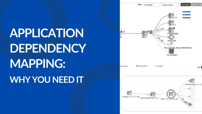
When it comes to improving service delivery, the ViVID service mapping connects all the dots related to application dependency and asset relationships and provides dynamic visualization. While doing so, it ensures that critical relationships are not overlooked and that impacted assets are clearly depicted. So the risk of implementing a new release or change-making gets reduced due to the visualization. As a result, incident and problem management response time gets reduced.
Schedule a demo today to learn more about how Virima’s Discovery and Dependency Mapping integration with ServiceNow CMDB can improve service delivery and make reporting more accurate and insightful!


